Barn-Inspired Bathroom Makeover
Hey there, Joanna Gaines.
We see your style.
Farmhouse meets industrial. Modern with a vintage feel. Functional. Livable. And full of personality.
If Joanna were to visit us in Cincinnati, she’d have to meet this homeowner who was able to channel her best Magnolia-style in the major renovation of the owner’s suite bathroom.
And boy, did we all have our work cut out for us. Sometimes, we look at a bathroom, pre-demolition, and admire craftsmanship and design from days of yore. (Like this bathroom from the 1930s-era that we talked about earlier.) But sometimes, as we’re planning out a project, we look at the space and think, yeah, this has got to go.
We think you’ll agree, the later was the case.
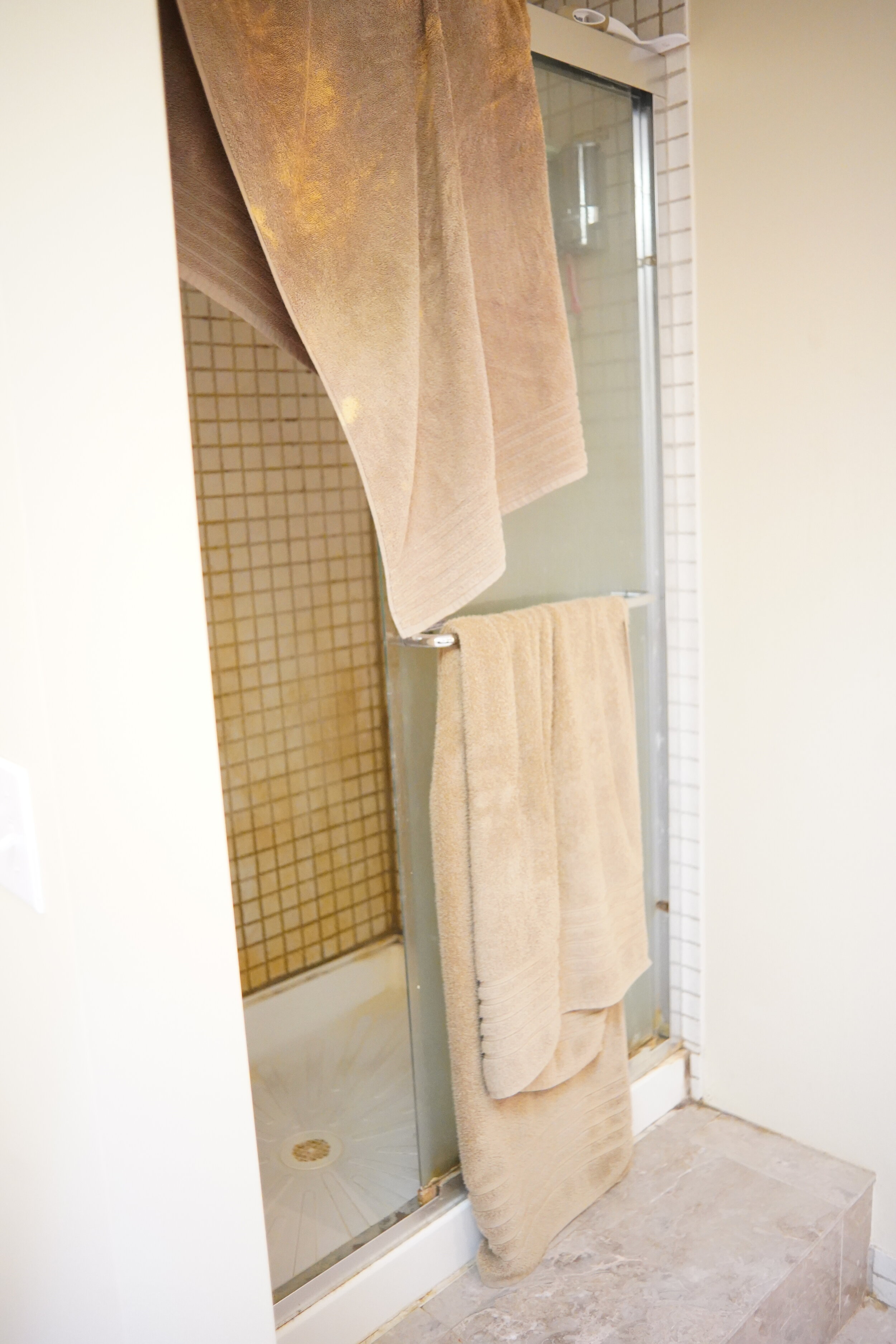
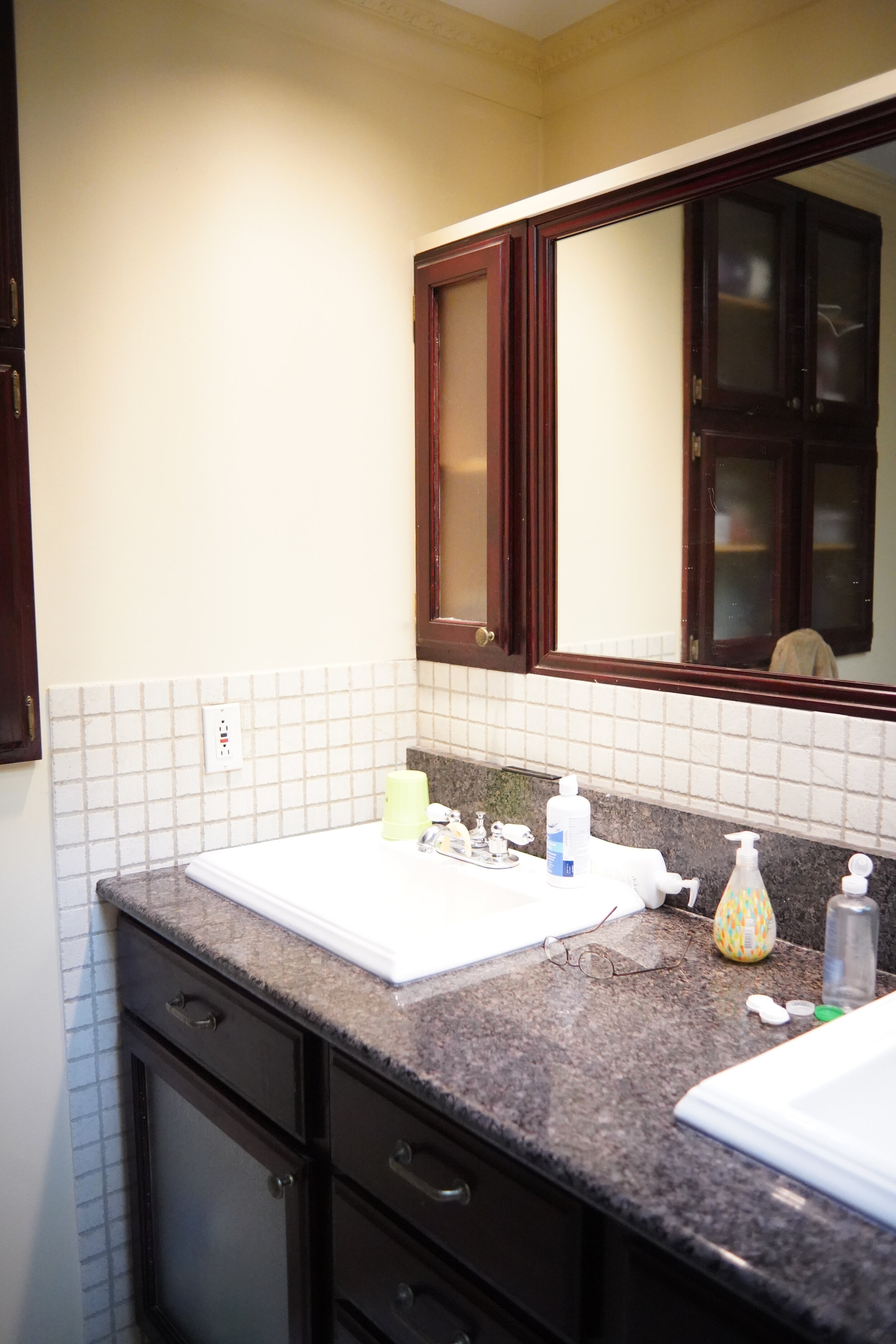
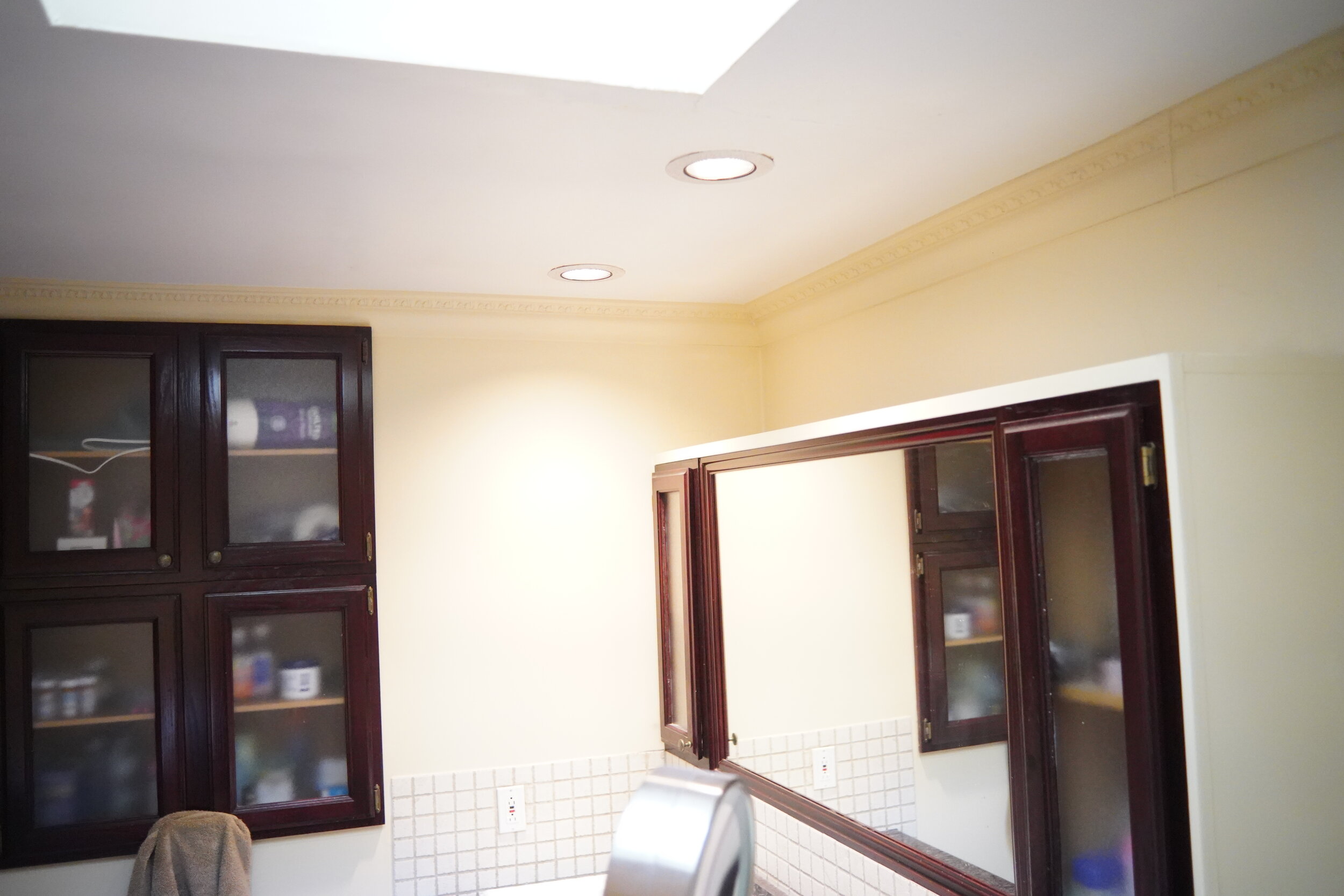
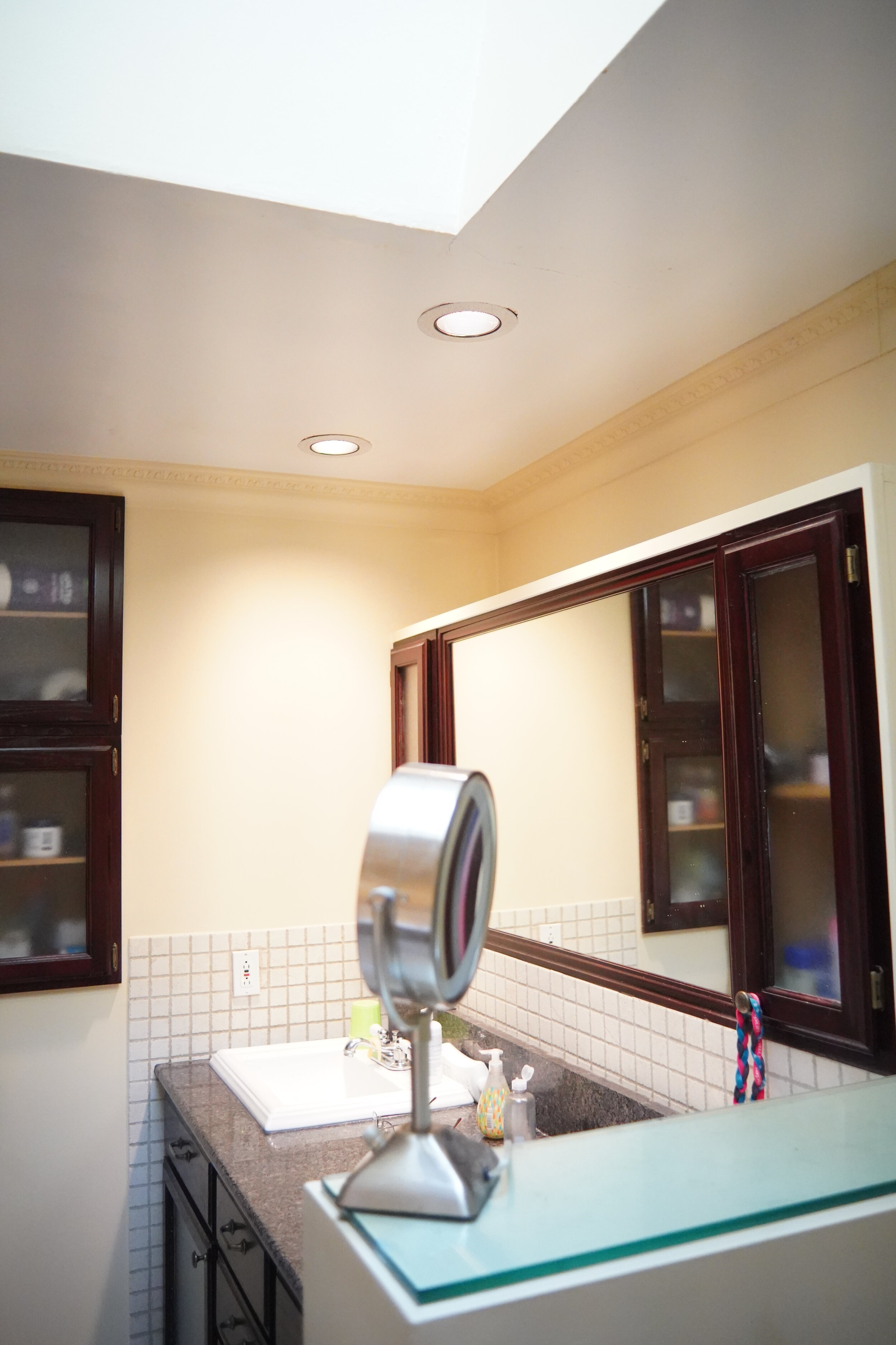
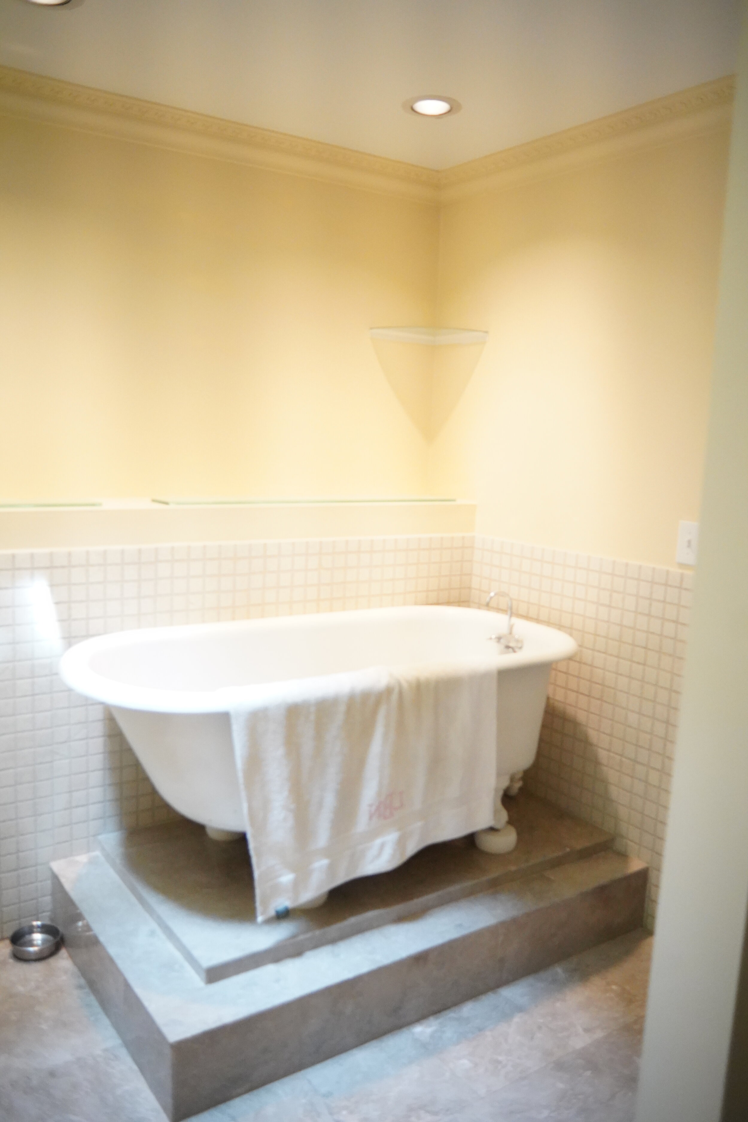
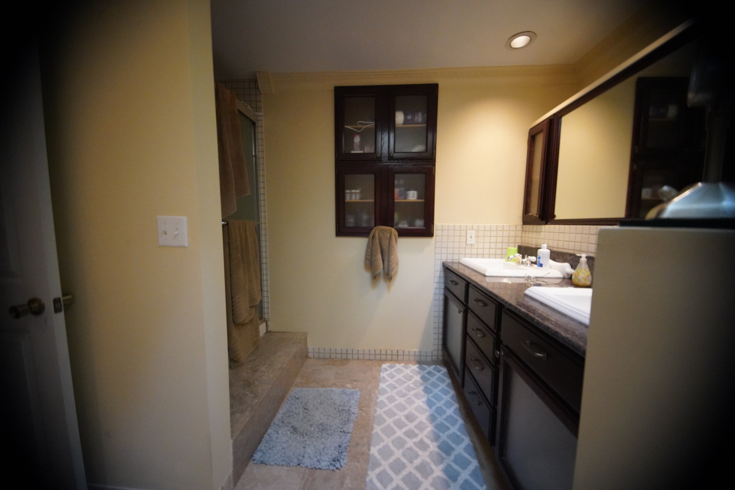
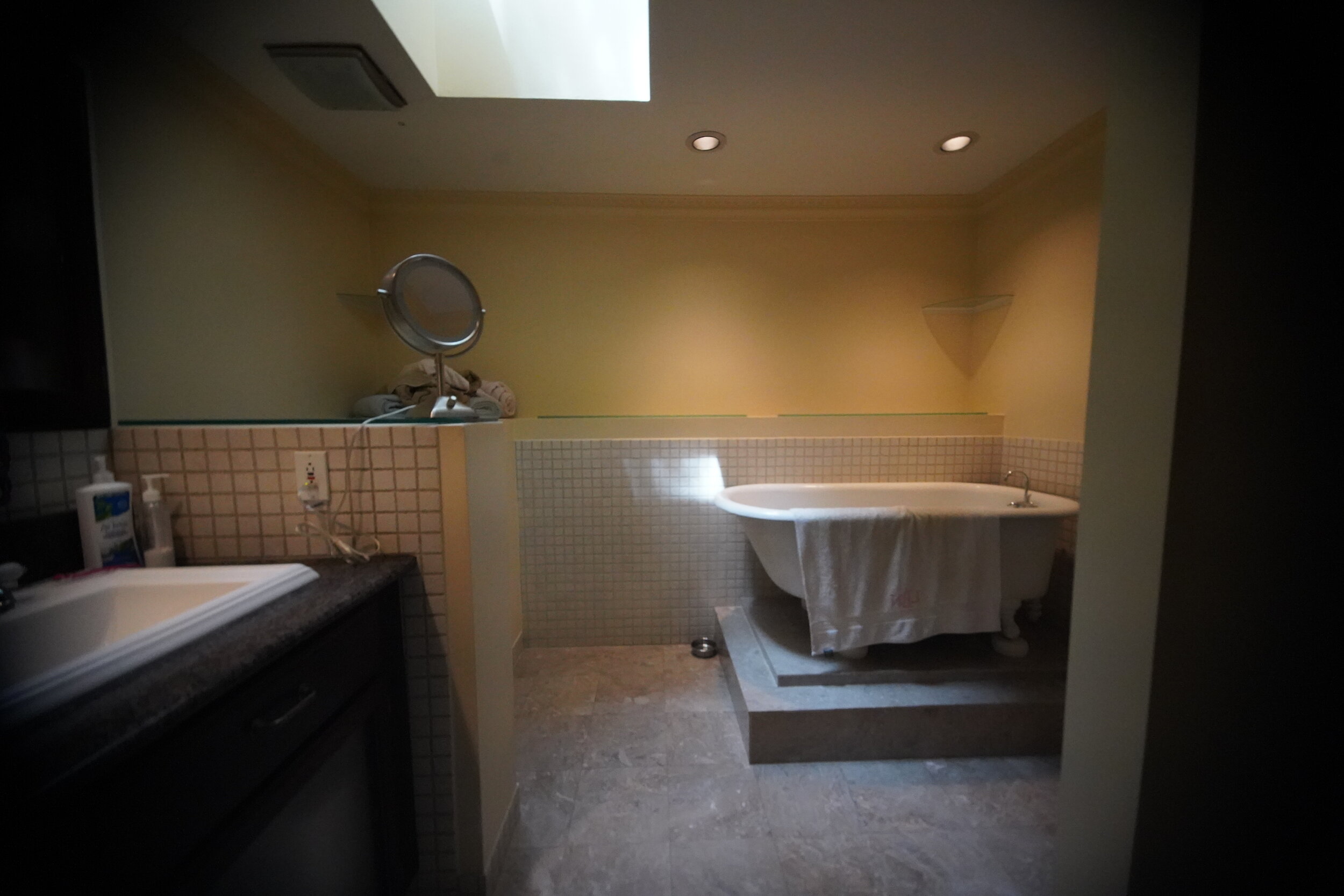
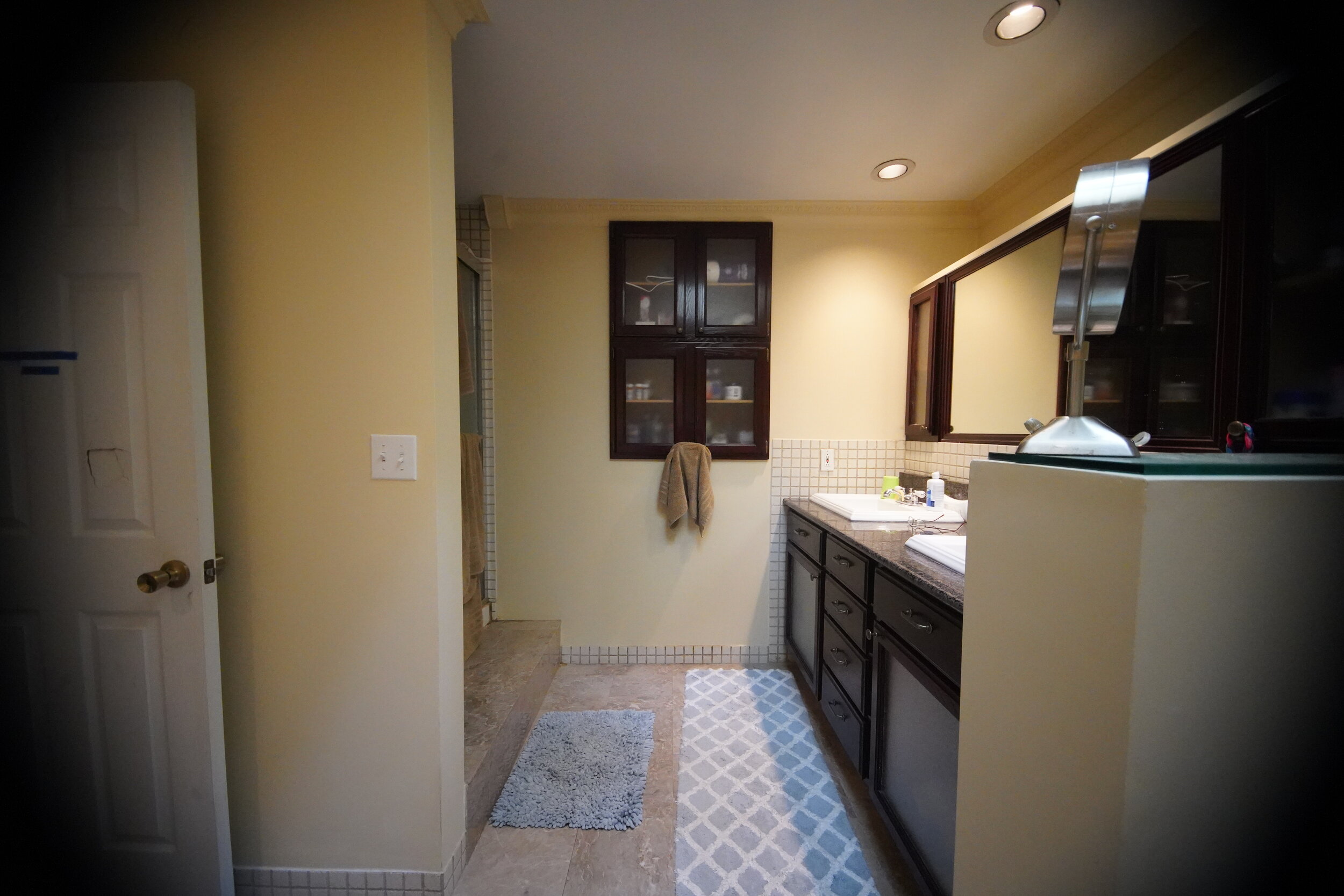
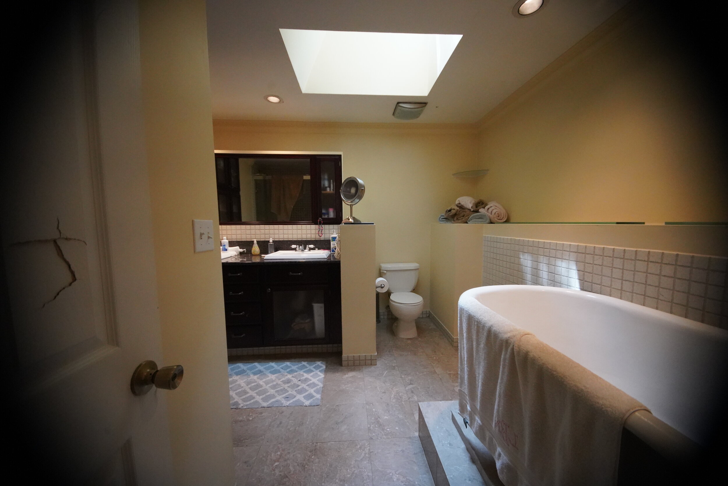
It was dated and dark. The layout was awkward. And the bathtub was stacked onto a platform, making the idea of bath time more about acrobatics then about relaxing tub time. There was no where to go but up. And we think Joanna would agree: mission accomplished.
Photo: Ross Van Pelt
This transformation is TV-worthy, for sure. There are so many details to talk about that we hardly know where to start.
Photo: Ross Van Pelt
Let’s start with the vanity. Designed and custom made by The English Contractor team, this gorgeous maple vanity was stained to a warm, honeyed brown. It was inspired by the homeowner’s passion for all thing equestrian, which drove the barn-like styling for the space. .
Photo: Ross Van Pelt
One must have for the vanity was a trough-sink, to continue the horse-inspired theme. This white, fireclay trough sink is from ALFI, paired with clean lines of the Brizio Odin faucets in matte black. We love the look of the longer sink with two faucets. The countertop here is a black, leathered granite, for a textured, vintage feel that adds tons of interest to this space.
Photo: Ross Van Pelt
The farmhouse feel continues with the custom-made medicine cabinet. Reminiscent of barn doors, the medicine cabinet is behind sliding mirrors on a metal track. New lighting illuminates this space with the Calhoun collection from Savoy House. Towel rings, on either side of the vanity, are from the Brizio Odin collection.
Photo: Ross Van Pelt
We love the geometric touch of the flooring that adds pattern and more interest to the space, yet also accentuates this modern farmhouse feel. These handmade cement tiles can be configured in several different patterns. (They are on sale right now, if you’re planning an upcoming renovation!)
Gone is the awkward soaking tub and shower stall. They were replaced by a shower with a much larger footprint, hidden by a wall covered in shiplap, naturally. The robe hooks make this wall extra functional, and they are also from the Brizio Odin line. We love how this wall has a barn feel with a modern flair.
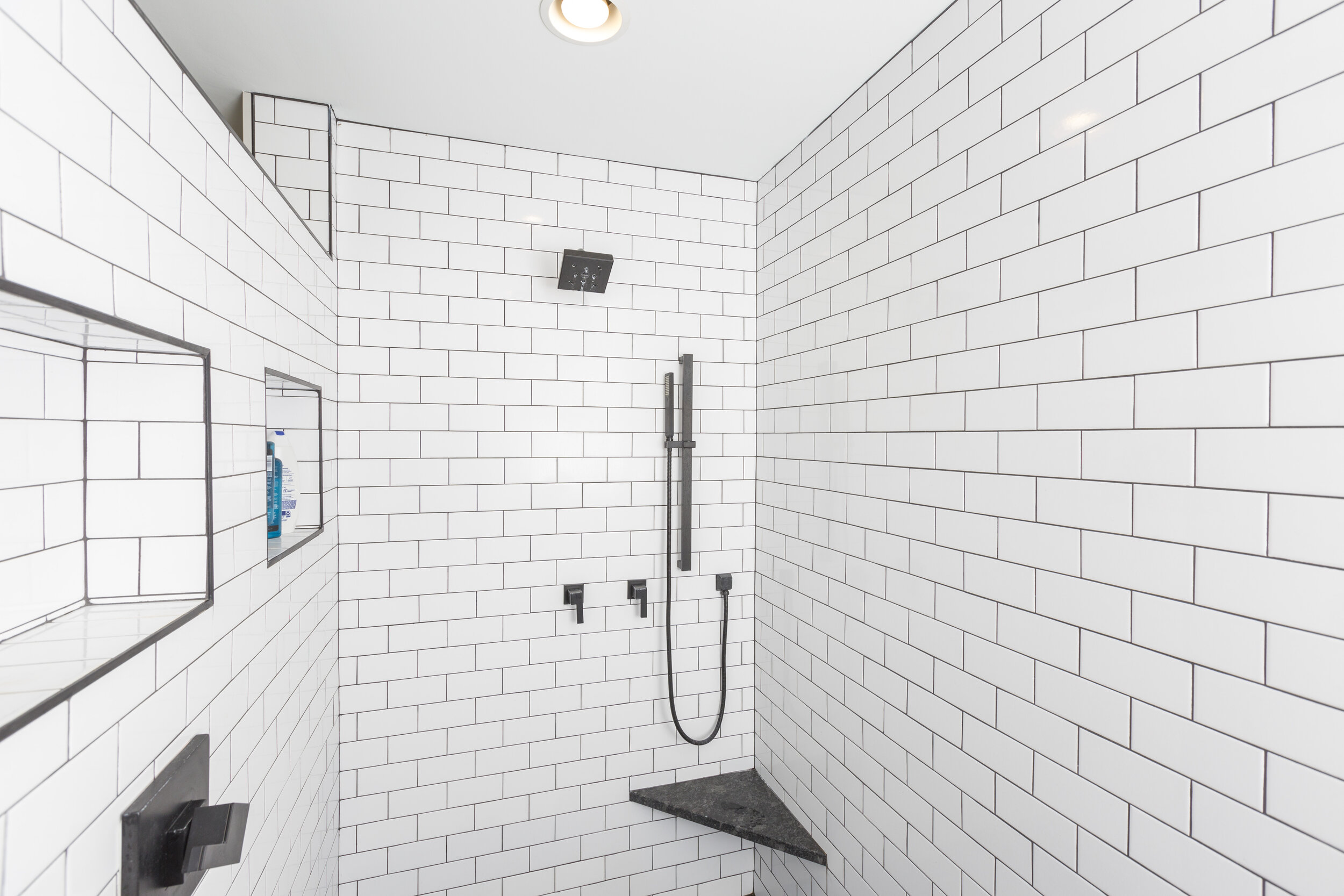
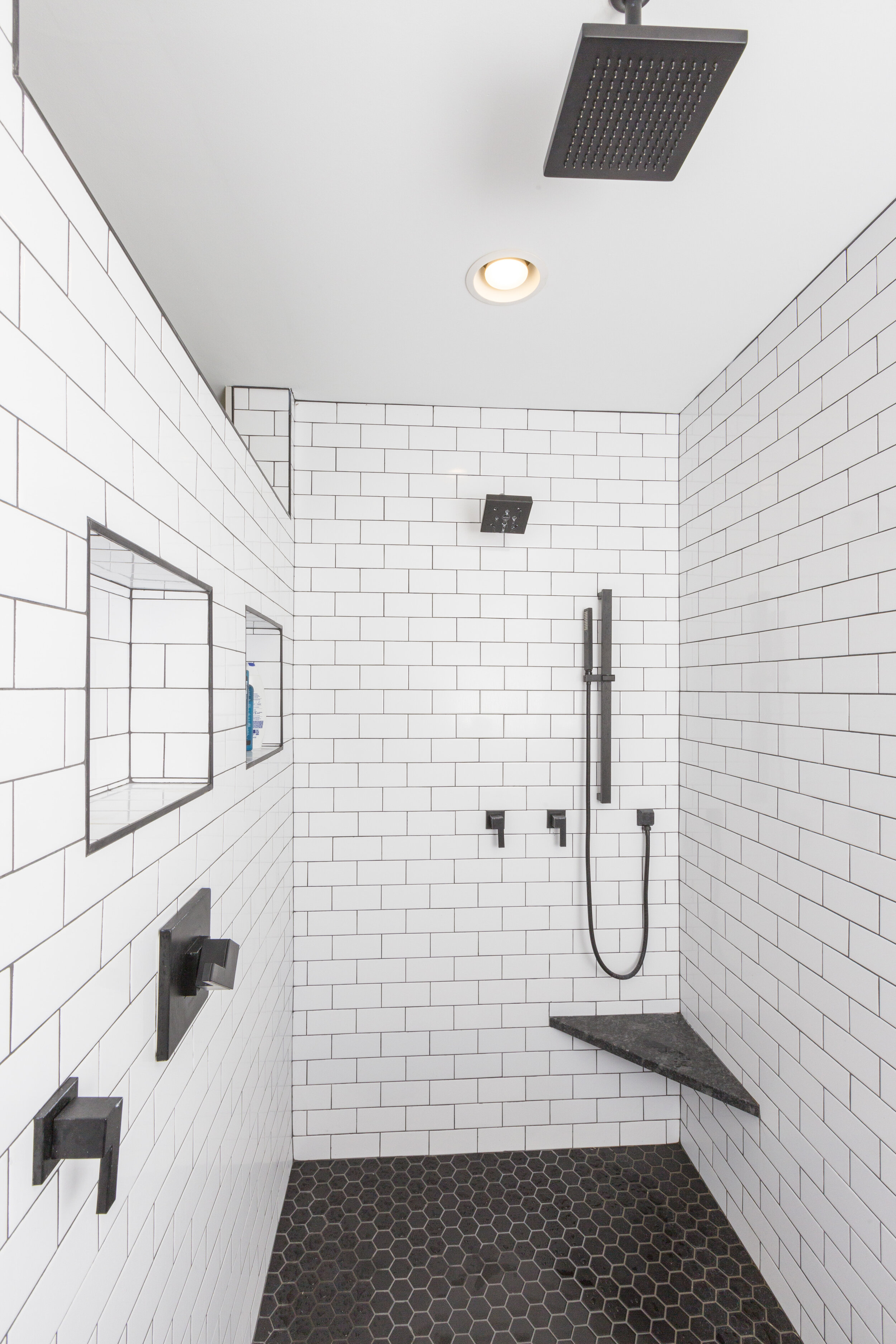
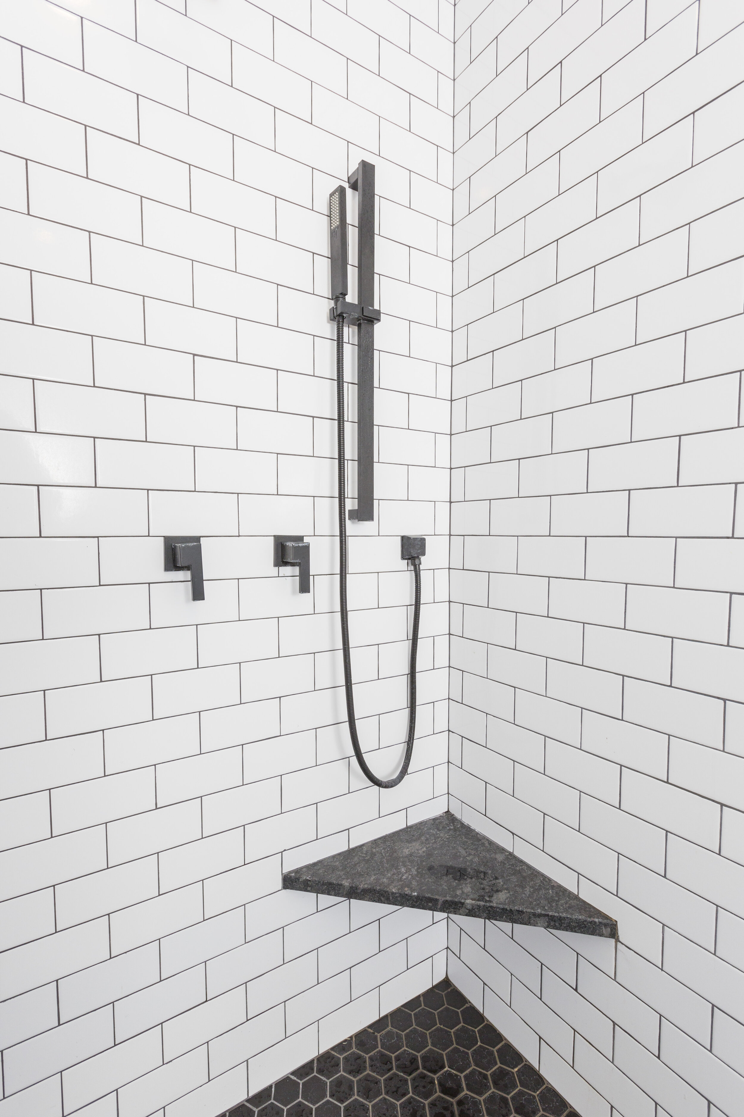
The black and white theme continues in the shower. The shower fixtures, from the Brizio Siderna collection, are in matte black. The wall tile, a 3” x 6” white ice subway tile from Hamilton Parker, was installed with dark grout for a more modern look. The corner seat was made with the same leathered granite as on the vanity. This shower is luxurious, too, with a handheld, wall-mounted, and ceiling-mounted shower heads. The floor tile is a foil to the wall tile: a black hex, also from Hamilton Parker, with a light grout.
Photo: Ross Van Pelt
We have to give you a peek at the commode. Sleek and modern, this wall-mounted toilet is tucked away for some extra privacy. the toilet paper holder is from Nameek’s in matte black
We love that designers like Joanna Gaines are so generous in sharing their ideas and designs. We get so much inspiration. We love working with a homeowner who is able to turn their passion and interest into a functional design. If Joanna were to take a look at this finished product, it may just inspire her!
Are you ready to transform an out dated bathroom? We should talk!

