Adding Classic Style to a Hall Bath
This is the story of a hall bathroom shared by two teenage boys. The original space had been remodeled long before these boys lived in this home, which was built in the 1940s and then remodeled in the 1990s. And, on the surface, this white-tiled space was working just fine. But it was showing its age, for sure.
Photo: Paige Pederzani
A drawer front, warped from years of use, would no longer stay put. The vanities, although large enough in size, just didn’t seem to provide enough storage for these busy teenagers. Despite the recessed lighting, the space seemed dark, especially without a window. It was time for an upgrade.
Photo: Paige Pederzani
This bathroom renovation project was another example of “you never know what’s behind those walls,” an issue The English Contractor team usually accounts for in our estimates and timelines because, well, you just never know what you’ll find when you start to demo a space. We already felt like the exhaust fan was in the wrong place, but demolition revealed that it was never properly vented. We further found a small leak that had caused some damage over the years. Plus an improperly constructed subfloor had to be totally rebuilt. What good are new, fancy finishes if the construction underneath is subpar?
Photo: Ross Van Pelt
Designer: Evolo Design
The homeowners enlisted Evolo Design to pick out the fishes that would withstand its teenage residents while appealing to their mother’s desire for some style. The overall aesthetic goal was to create a usable space with classic style, providing a bit more light to the space. Although the layout of the space was a bit unusual, as this home as received new additions over the years creating a hodgepodge effect, the ultimate decision of the homeowners was to keep the layout as is, but make the most of it with the help of an interior designer.
Photo: Ross Van Pelt
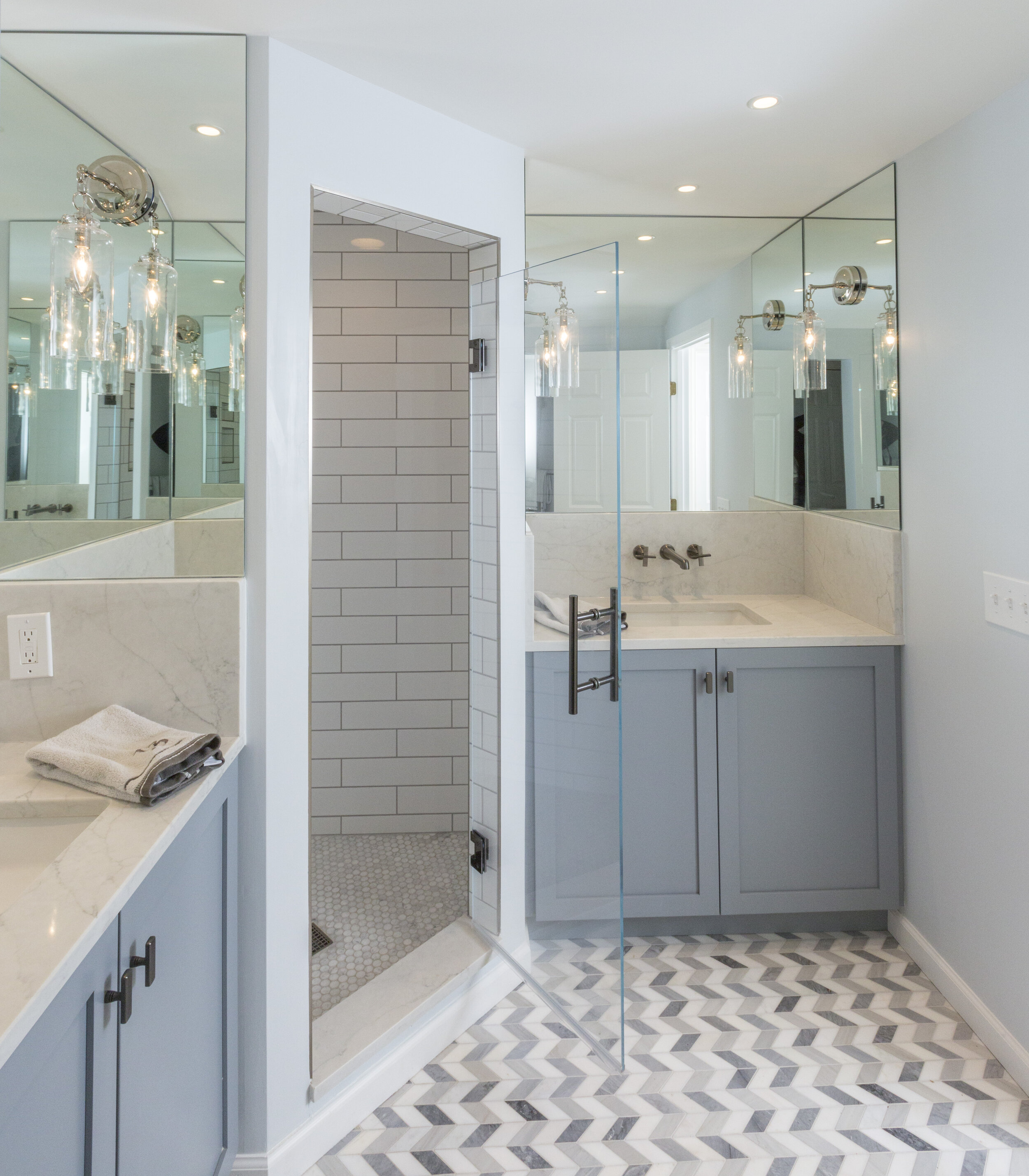
Although this hall bathroom lacks a window, it’s no longer dark. We added additional recessed lights, this time in LED. The vanity alcoves were wrapped in mirrors on all three sides and sconce lighting from Visual Comfort were mounted directly onto the mirror. The result is a space that feels bright and clean.
Photo: Ross Van Pelt
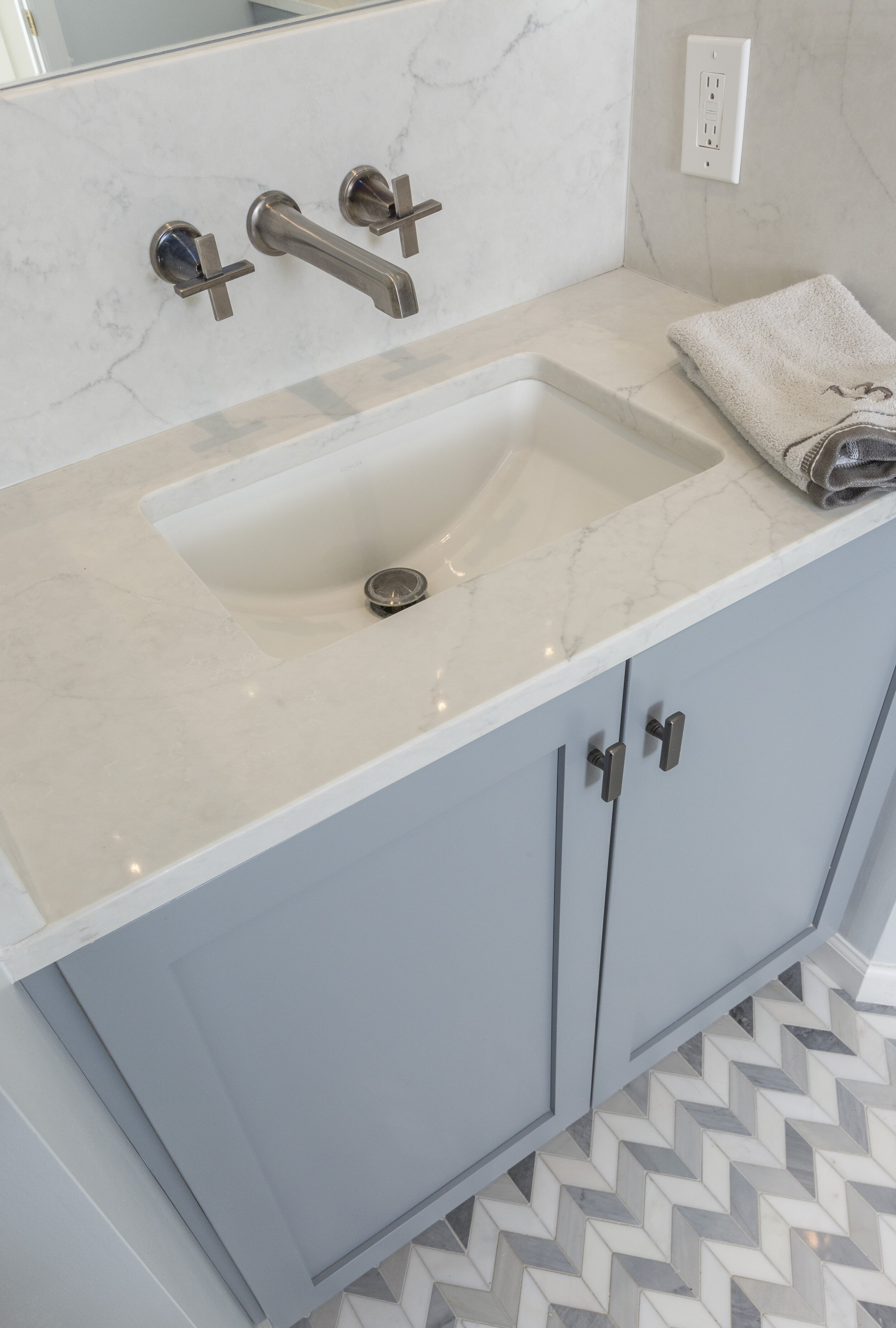
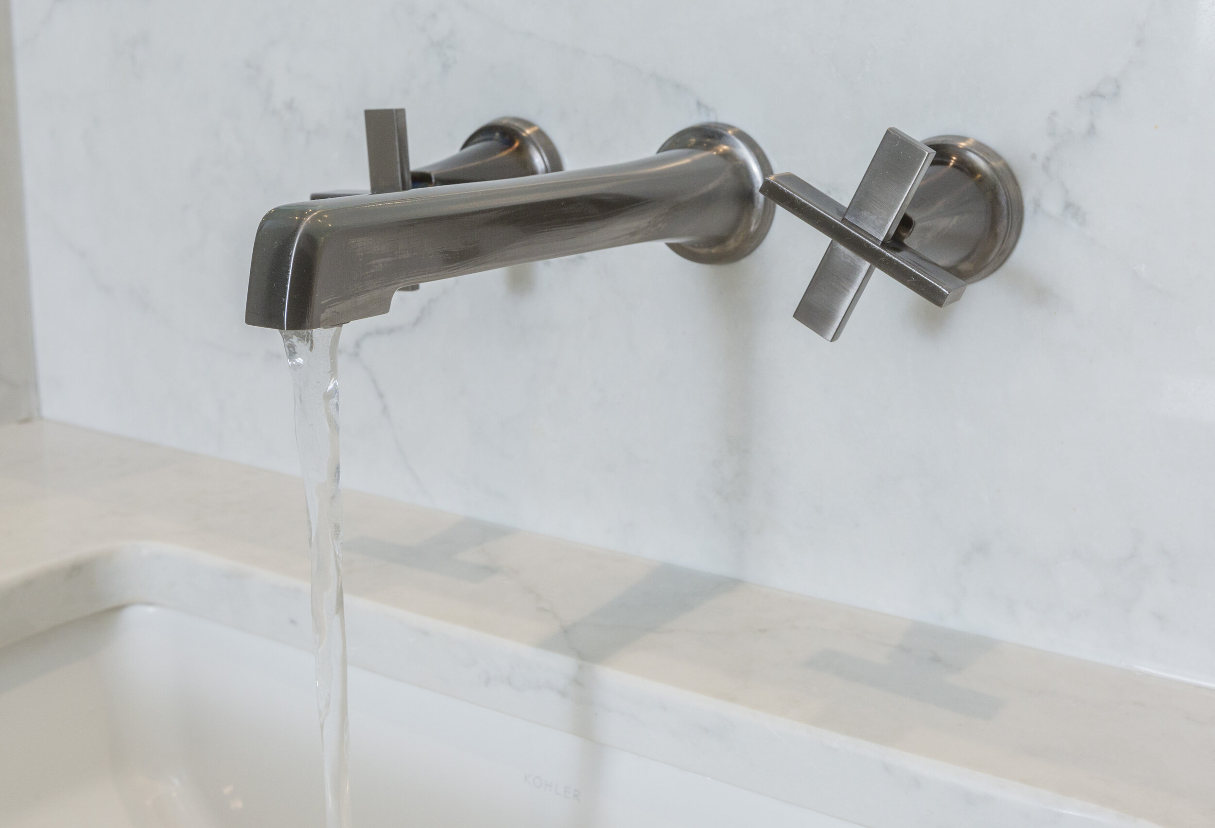
The marble flooring in a chevron pattern is a real show stopper. Dirty clothes go immediately into the laundry because who would want to cover up this floor? The natural stone has some variation to it, which adds a ton of interest to the space. The color and design are both mom- and son-approved. We love how this space all come together with the grey vanity topped with a Vadara Sereno Bianco Quartz. The backsplash helps keep the mirrors free from toothbrushing and face washing splatter. The wall-mounted, cross handle faucet from Brizio is in a luxe steel finish, a beautiful compliment to both the floors and the brighter chrome from the lighting.
Photo: Ross Van Pelt
The quartz countertop sits a top a rectangular, undermount sink from Kohler. The layout provides enough counter space for bathroom supplies, minimizes mirror splash, with undeniable style.
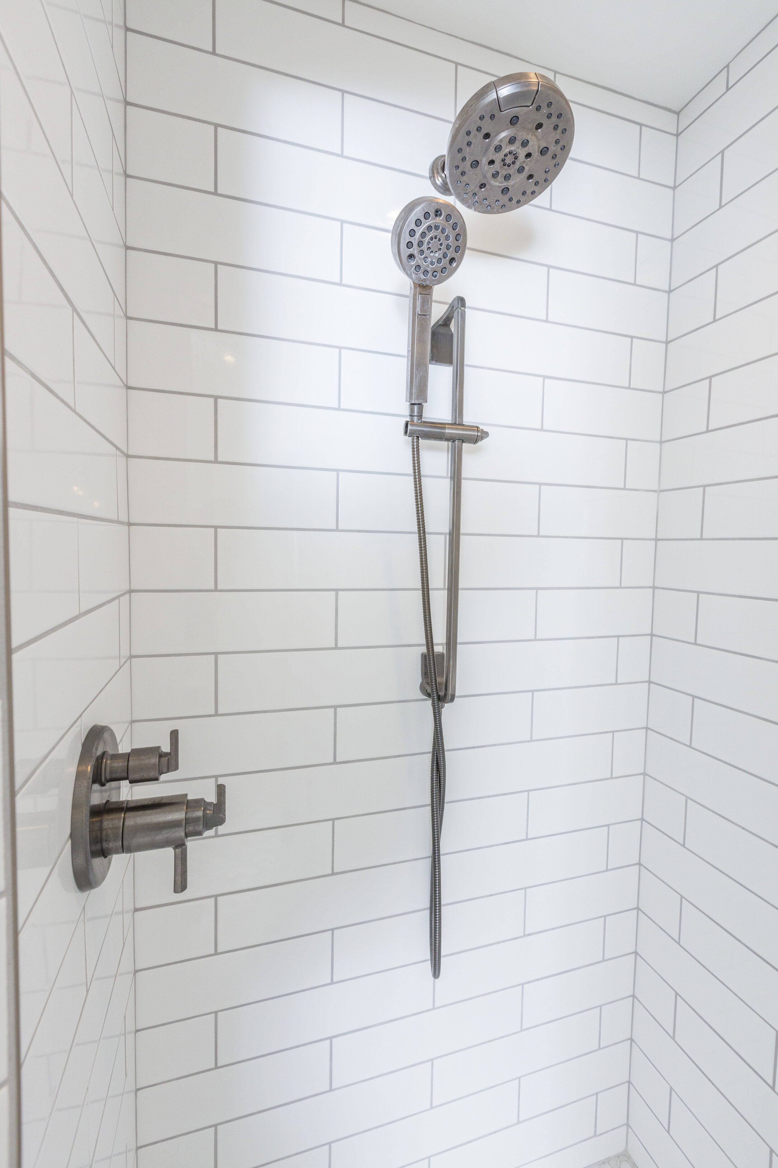
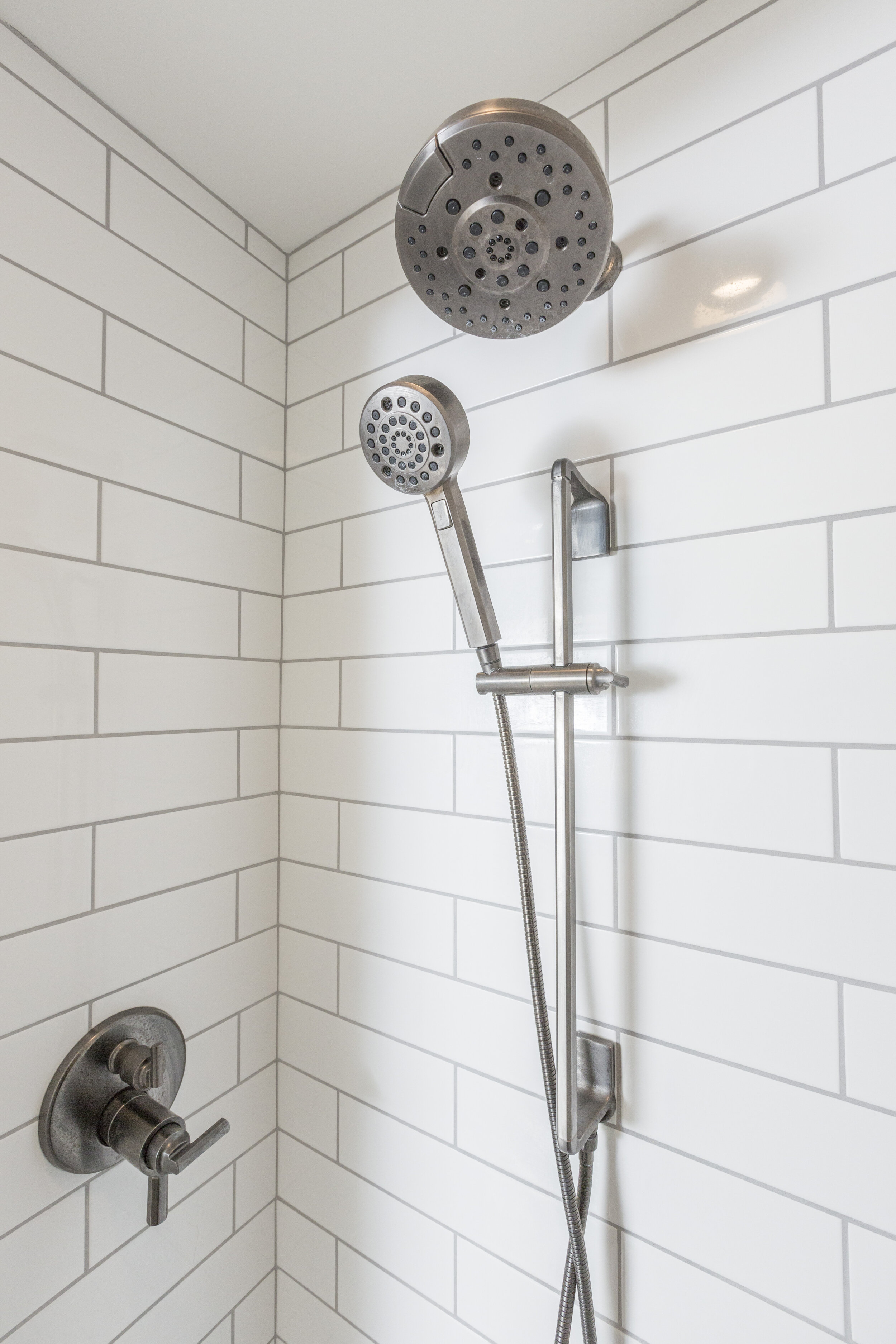
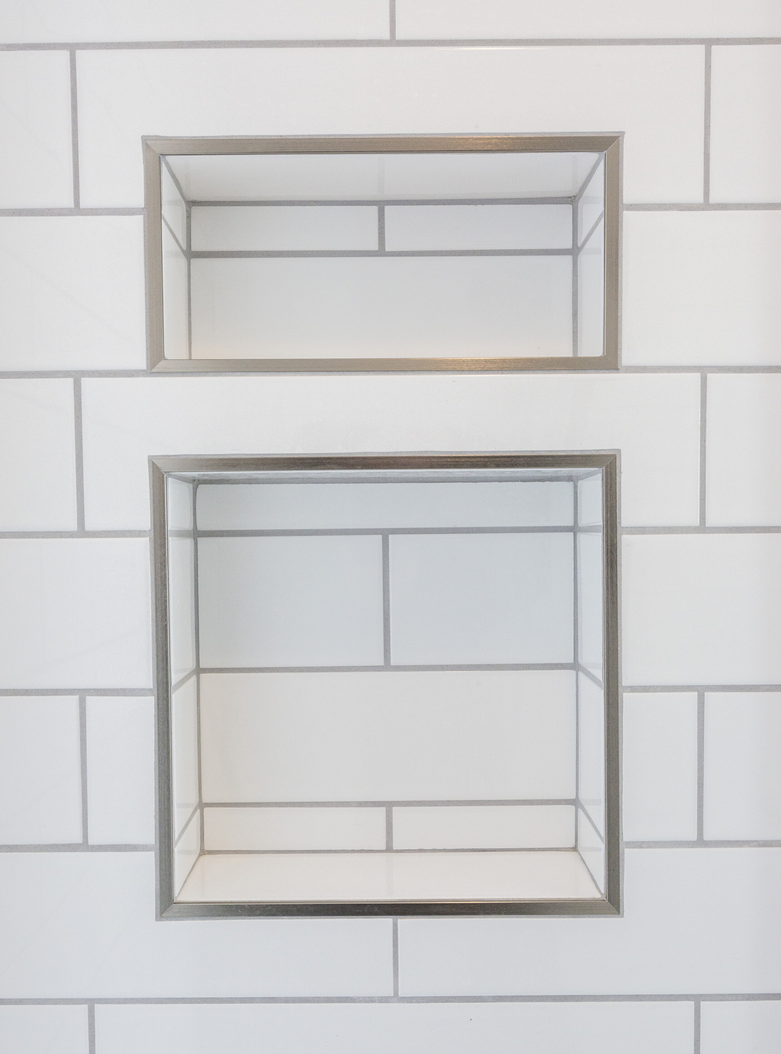
The shower is tucked into a corner in between the two vanities. Although it’s still outfitted in white tile, the change is pretty dramatic. The old hardware was replaced with a shower system from Brizio, which includes a handheld component. The outdated soap dish was replaced with two shower niches, outlined in metal chrome. The shower walls may look like your standard subway tile, but they are anything but. We love the look of this elongated rectangular tile, measuring a full 16-inches in length, from Anatolia Ana Soho line from Hamilton Parker. Although not pictured here, the shower floor is a penny round marble from Ann Sacks, which adds a beautiful, soft contrast to the strong lines of the shower walls and bathroom floor. We love the use of Silver Bullet grey grout to continue the grey and white theme. The new shower door is frameless, held in place with luxe steel finished hardware.
The end result of our work is this beautiful space with designer style. Our work here, though, encompassed more than the eye can see. This space was gutted down to the studs, so we were able to course correct some issues with this bathroom’s electrical, exhaust and structure. After all, any room needs more than style to function well. Beautifully designed and solidly constructed, with attention to detail every step of the way—that’s what every project from The English Contractor delivers.


