Bold & Brassy Kitchen
Photo Credit: Ross Van Pelt
Designer: Evolo Design
For this Terrace Park home, we teamed up with Evolo Design to breathe new life into this large kitchen. The old kitchen was tired and worn out. The space was an addition made to the home in the 1990s, expanding the footprint of this 1940s home. We hear so much about open concept homes these days, but this large space is tucked away in the corner of the home, opening up to a breakfast room, which leads to a large family room in the opposite corner of the home. A true hub of the home, the location of this kitchen really worked. The layout really worked. There was plenty that wasn’t working, though. But it was nothing that a keen eye for design, expert craftsmanship, and a builder and designer who were ready to collaborate and problem solve couldn’t manage.
Photo Credit: Paige Pederzani
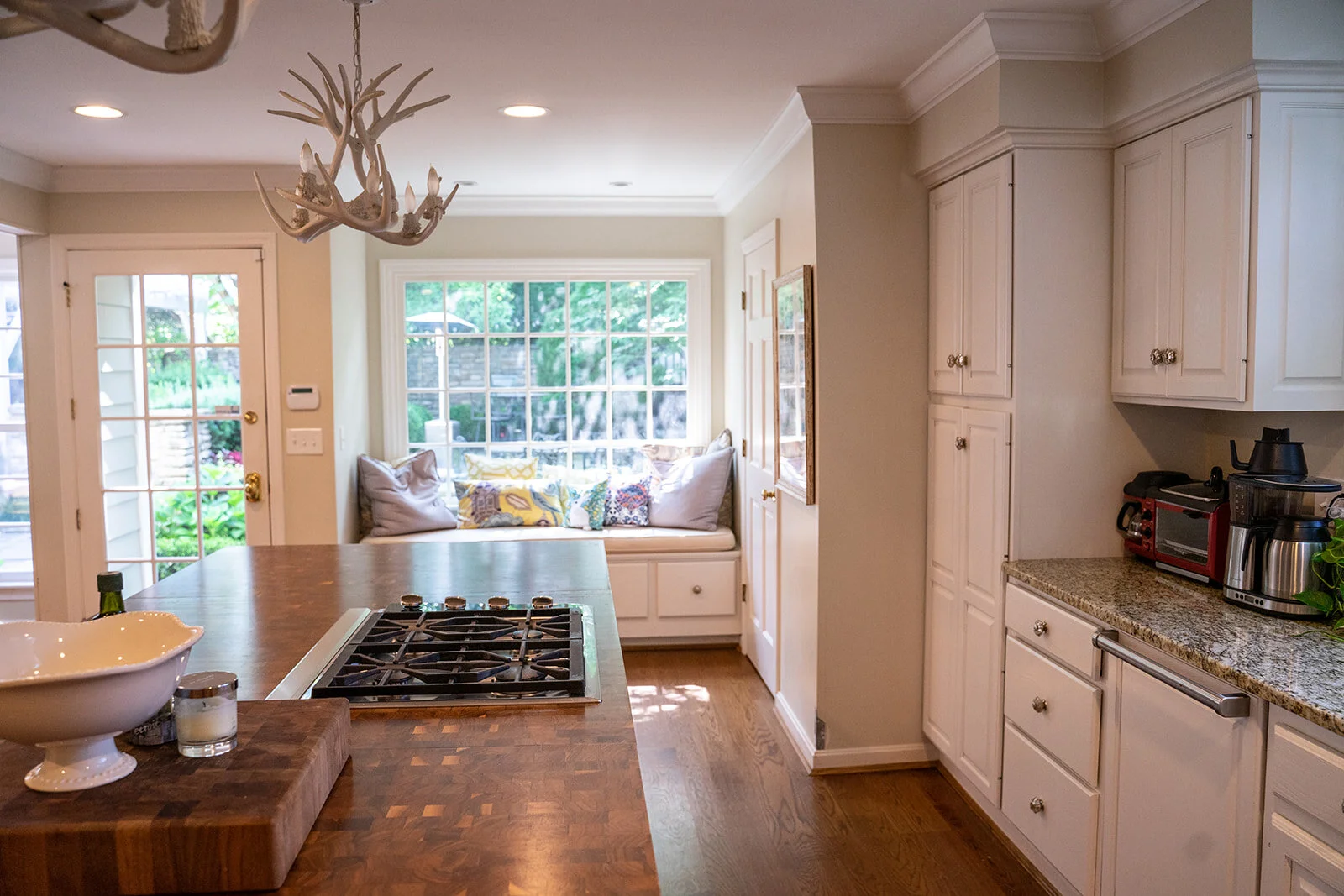
In this photo of the old space, you can get a feel for the transformation. In order to extend the life of these cabinets, they’d been spray painted white a few times. Initially, one coat of spray paint and mercury glass drawer pulls gave the space a shabby chic feel. Accents of orange and turquoise and antler-shaped chandeliers gave it more of a boho, beachy feel. The far wall of cabinetry included open shelves with a painted chevron background, where the homeowners kept books and snacks at the ready. But the aging cabinetry needed another coat of paint, new hinges and new hardware. The butcher block countertop had been installed in 3 separate pieces and was starting to shift, making it difficult to raise the downdraft ventilation. The large picture window above the sink let in plenty of light, but the soffits kept the space feeling a little dark and enclosed.
Photo Credit: Paige Pederzani
Here’s another view of the kitchen. A window seat was another thing the homeowners really loved about this space, a perfect nook where the kids like to sit to ask questions about homeowner while dinner prep is happening. A large sink is across from the 4-burner stove top and a drawer microwave was also built into the island. A panel front dishwasher was located adjacent to the sink. The back of the house has plenty of windows, but the space still felt rather dark.
Photo Credit: Ross Van Pelt
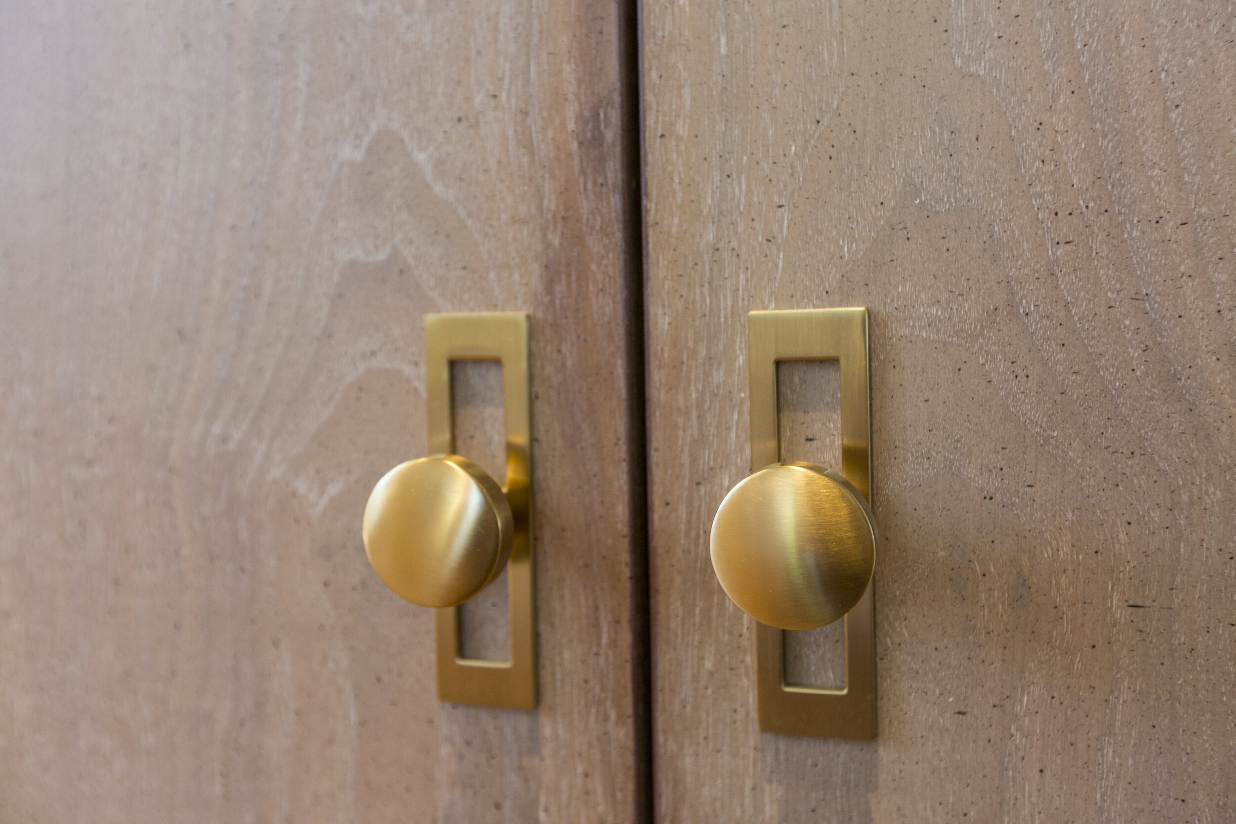
The cabinets are still white and the layout is mostly the same. But what a transformation. Mercury glass drawer pulls were replaced with beautiful brass pulls and knobs from Top Knobs, both affordable and functional. The brass story continues with custom-made chandeliers. The four-burner range top was upgraded to a six-burner from Wolf-Subzero. It’s signature red handles really pop, and relocating them from the countertop to the side preserved room for the extra burners on the island. The new microwave from Sharp is slightly larger.
Photo Credit: Ross Van Pelt
Gone are the dated soffits and upper cabinetry. The homeowner had imagined a subway tile covering this newly opened backsplash, going from countertop to the skylight. The style gurus at Evolo took that vision one stop further with the Frame by Barbara Barry tile by Ann Sacks. A raised frame around the traditional subway tile makes such a difference, giving a subtle texture to this space. Upper cabinetry was replaced with open brass and glass shelving, both beautiful and functional.
Photo Credit: Ross Van Pelt
Function + Beauty is the theme of this space, which continues at the kitchen sink. Here we find a brass pull down faucet from Newport Brass, along side an insta-hot faucet. And the kitchen sink from Galley doubles as a workstation. This large sink can hold a cutting board, drying rack and colander.
Photo Credit: Ross Van Pelt
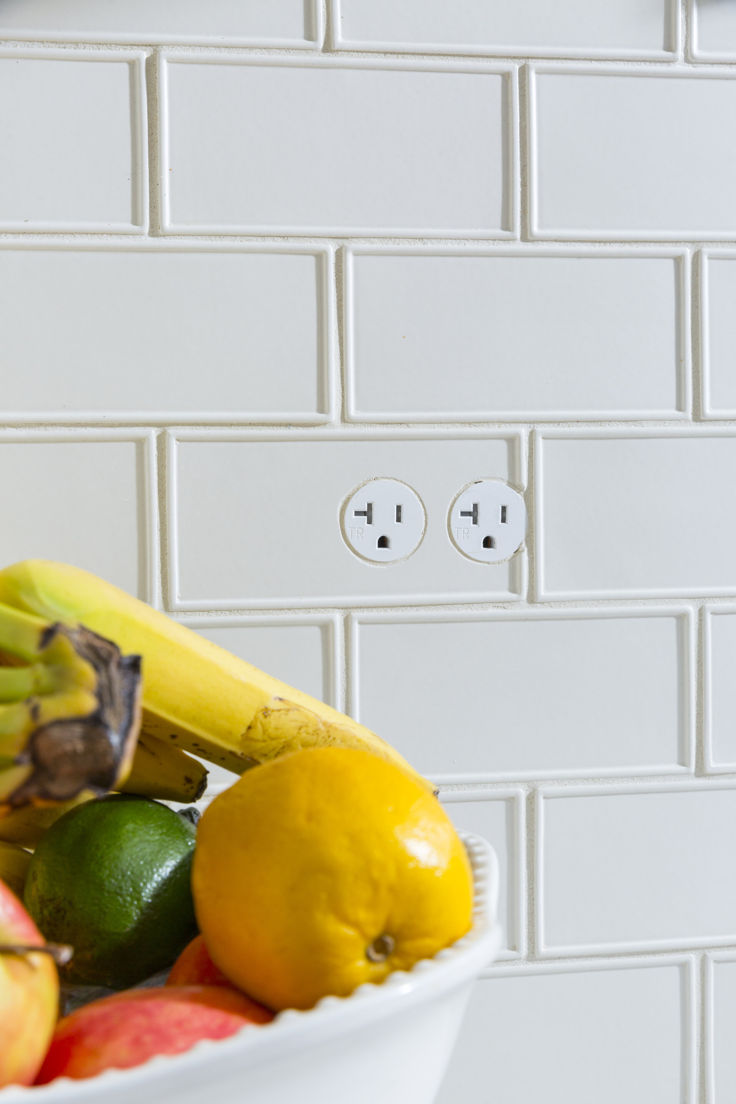
We call this image Still Life with Bocci. The bowl of fruit seems like the most eye-catching accessory here, but it’s the Bocci outlets steal the show, precisely because you don’t immediately see them! We love that these outlets can be integrated into the tile. These outlets can do their job without stealing the show from the tile backsplash.
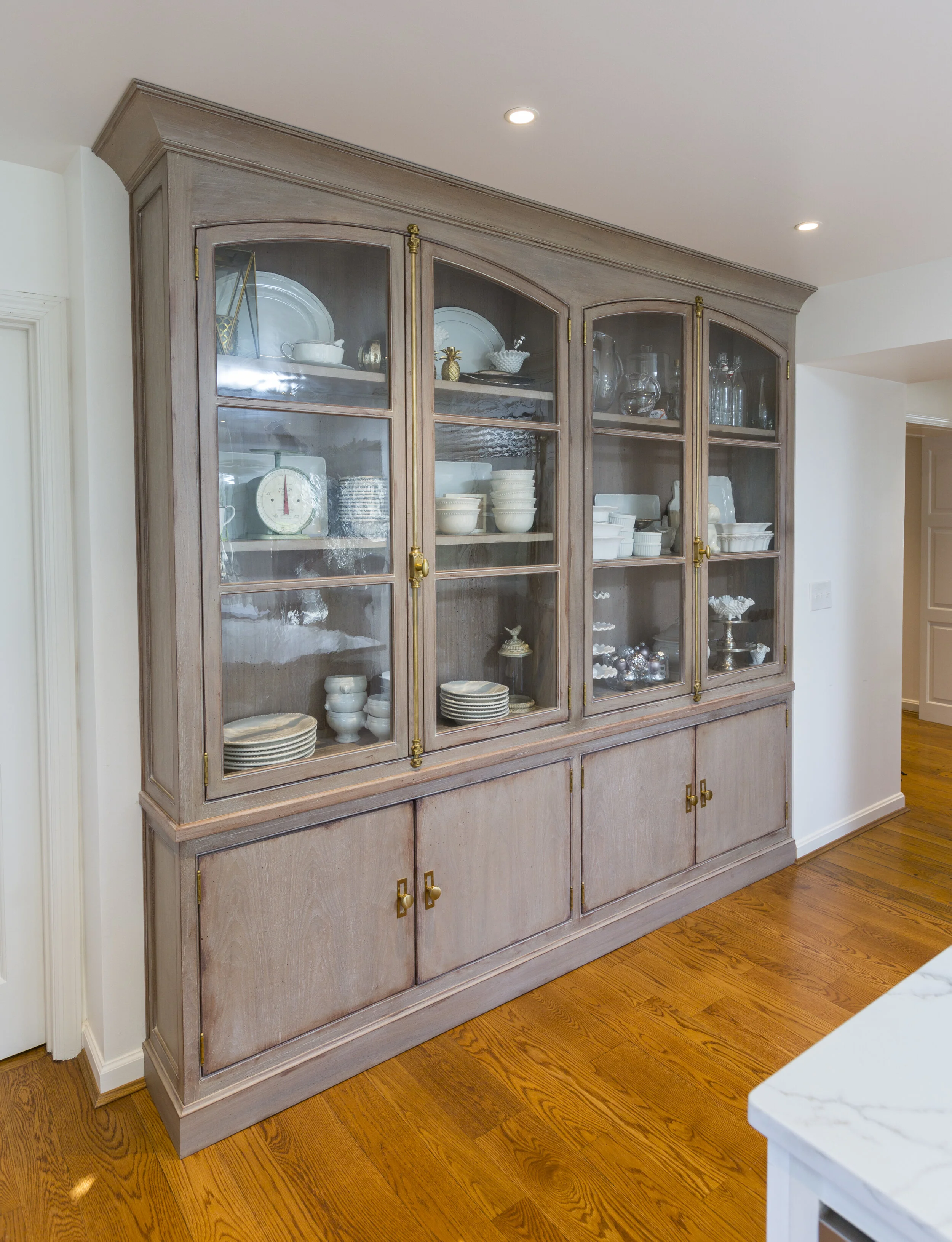
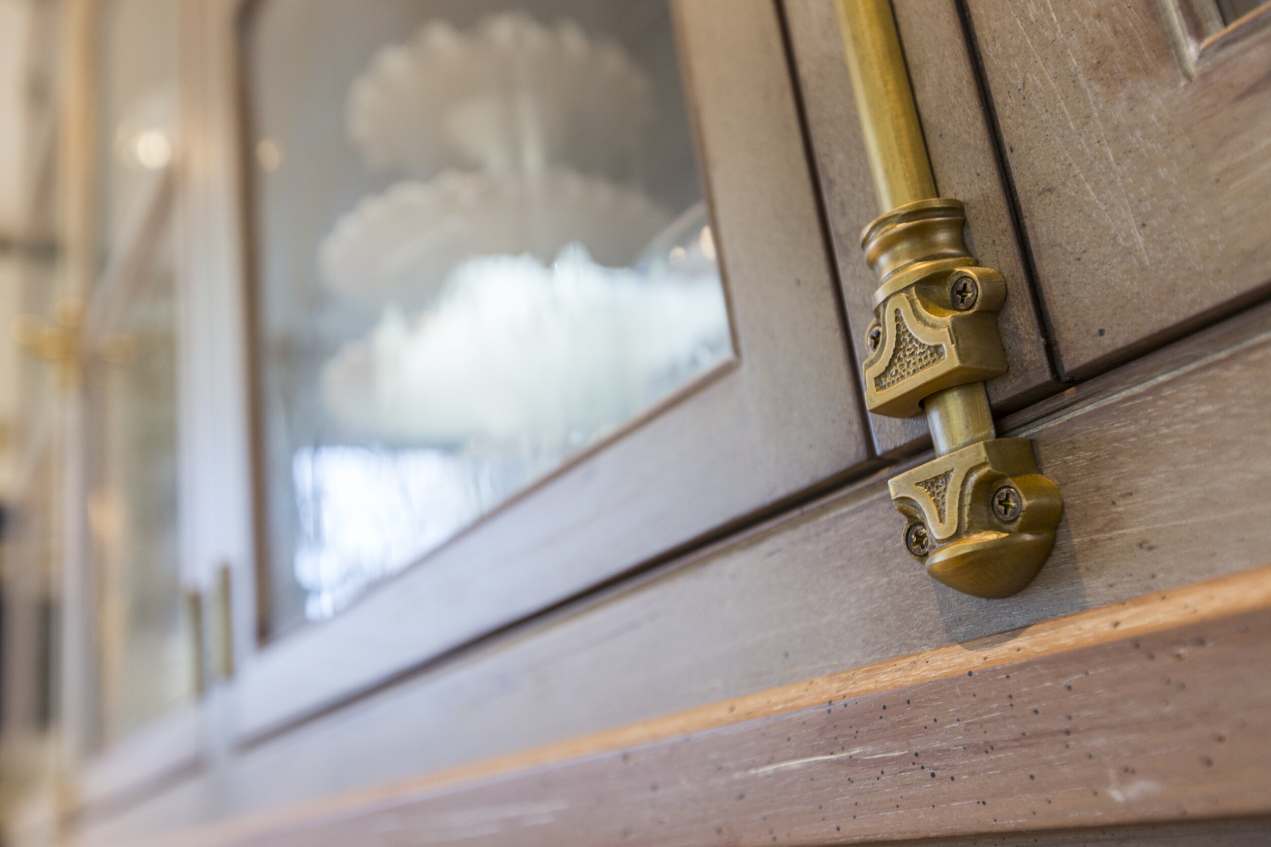
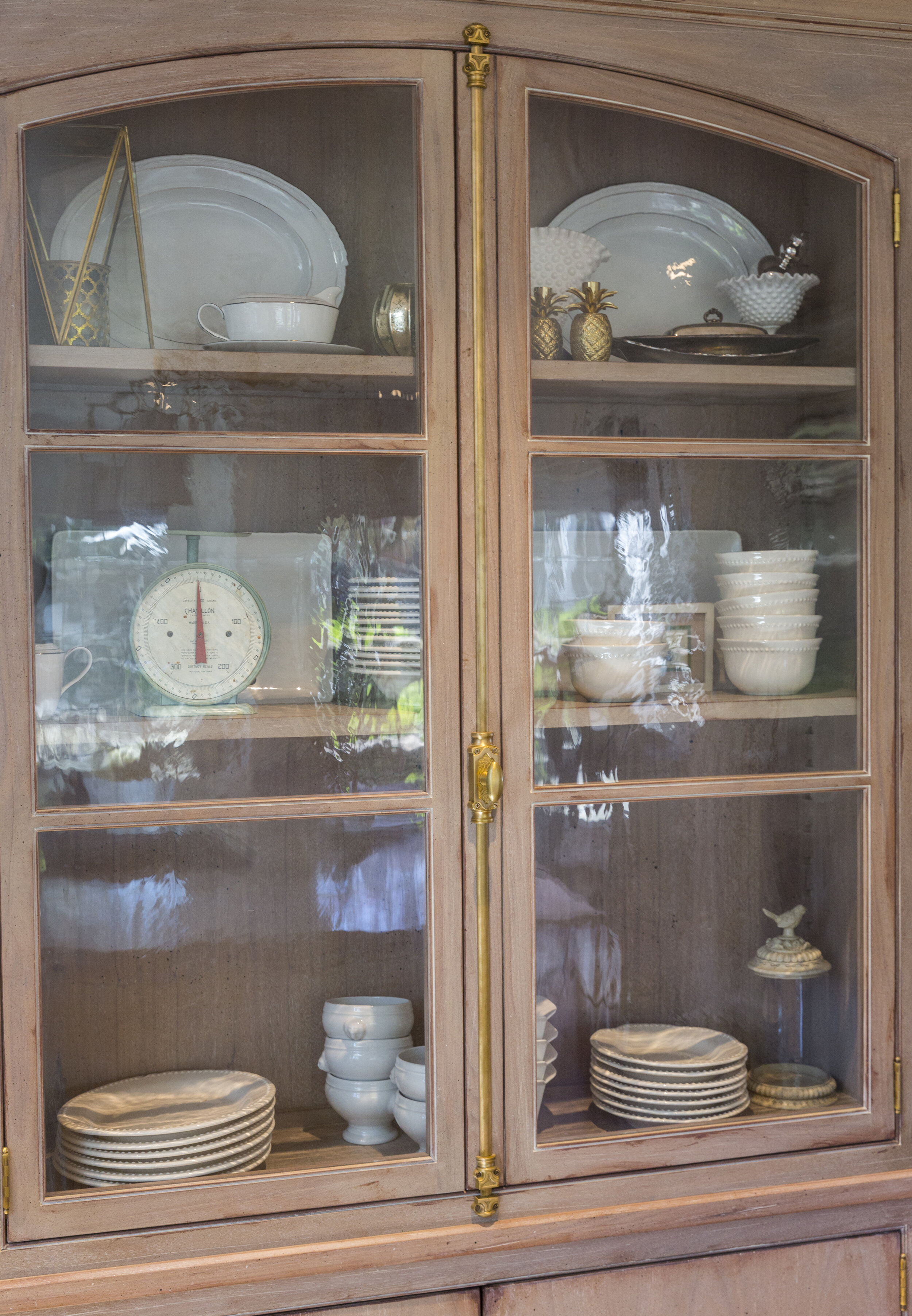
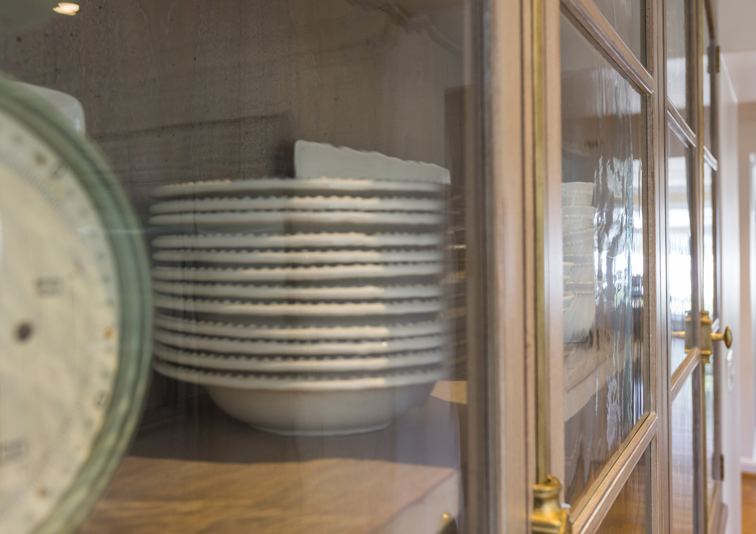
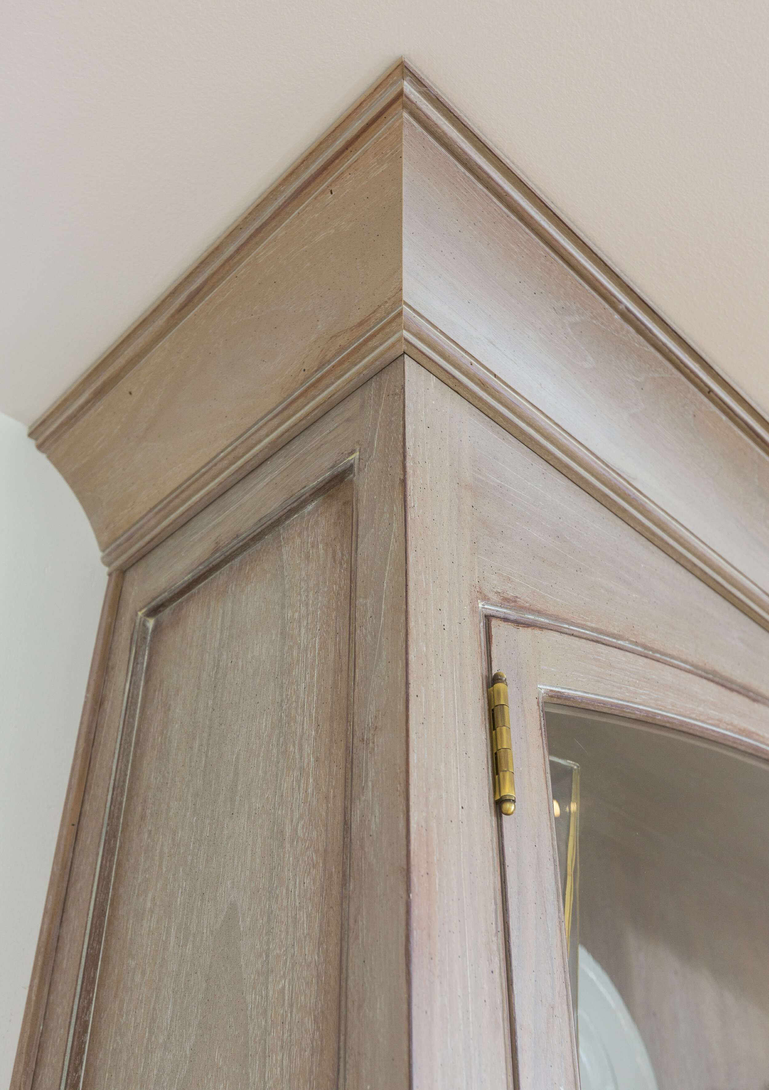
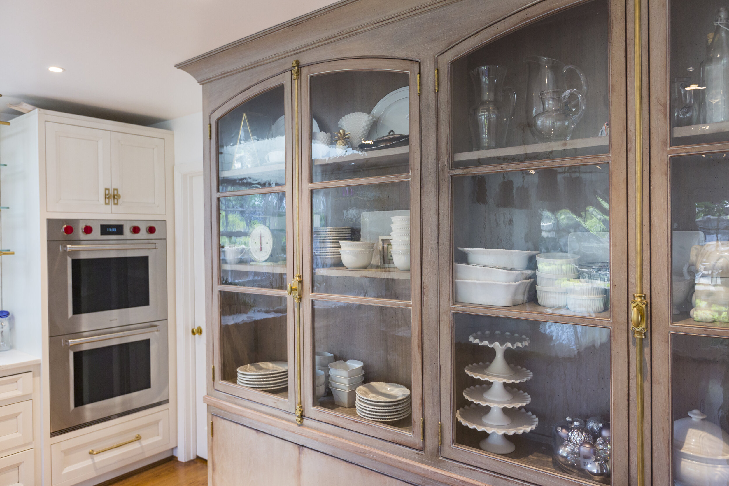
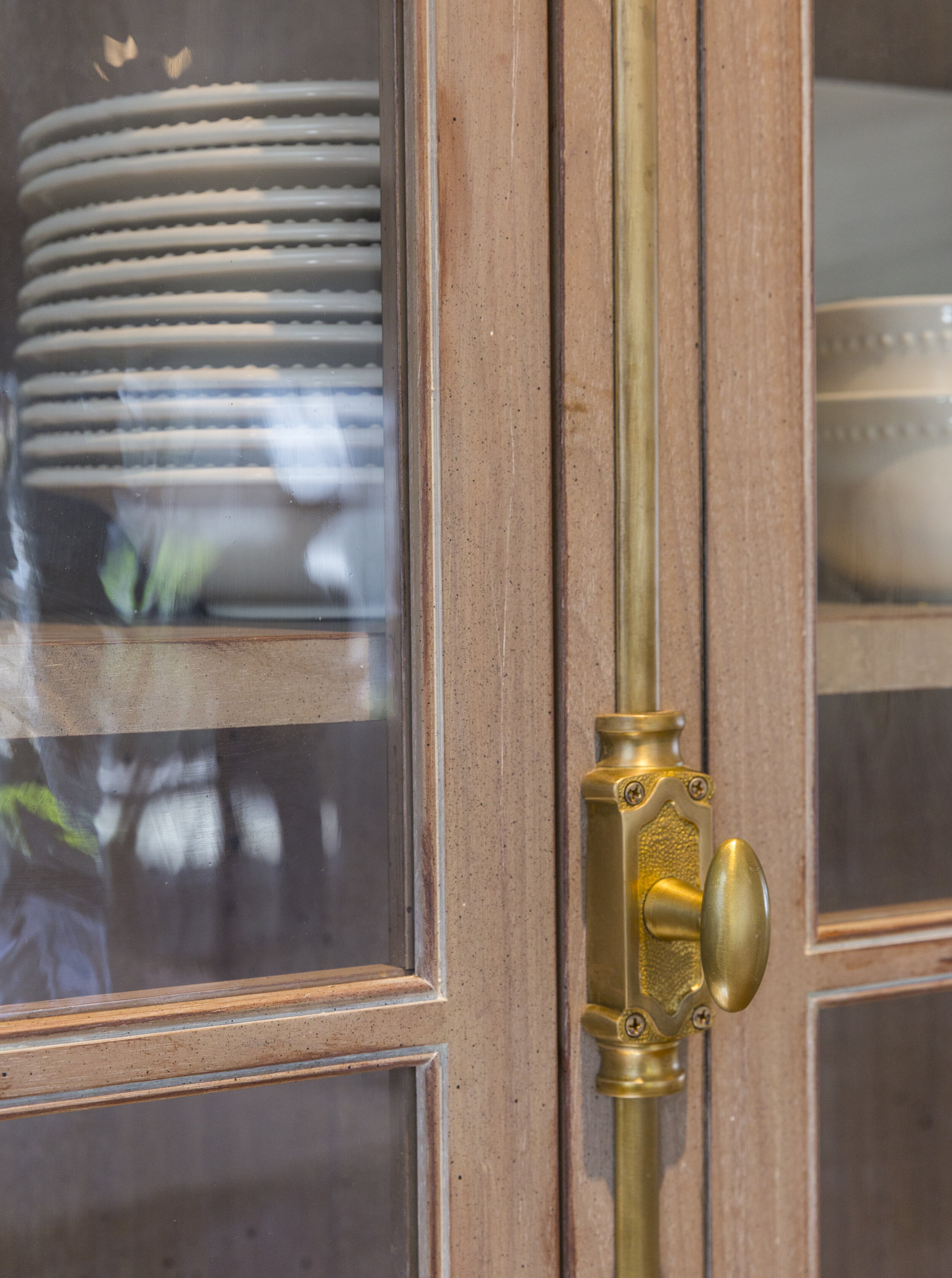
The homeowner wanted storage for her collection of white plates and serving pieces. The Evolo team was inspired to create a real show stopper to greet people as they walked throughout the backdoor. This custom piece was built in partnership with Tom Ernst cabinetry. The distressed finish, wavy glass and brass hardware make the cabinetry look like an heirloom hutch that has been passed down for generations.
Photo Credit: Ross Van Pelt
This kitchen already had a Subzero refrigerator that was in great shape and the homeowner opted to save a little budget and reuse it. We were able to improve the layout of this section of the kitchen, centering the refrigerator on the wall and creating symmetrical pantry space with pull out drawers on each side. The previous kitchen just had a large closet on one side of the fridge.
Photo Credit: Ross Van Pelt
Our team also replaced older double ovens with brand spanking new ones from Wolf Subzero. Flush mounting the double ovens give this space a sleeker look and the red handles give another punch of color.
Is your kitchen begging for a touch of brass? Are you ready for an appliance upgrade. Then we’re just the team to talk to. Let’s set up a time to chat.


